Arya.ai Website
Arya.ai's old website looked like a corporate site, not an AI company - its CTAs didn't stand out, navigation confused people and it didn't look secure. I redesigned it as the only designer (ver. 2), then made the components for ver. 3 when the products were rebranded as Horizon AI.
80%conversion rate on sign up and contact
Auditing the old website
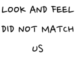
- Look and feel: a very corporate website - we are an AI company. It needed to feel young, safe, smooth and lively, for people from tech.
- CTAs didn't stand out - the orange “Start free trial” looked dull and unrelated to the API.
- Too much information under one heading; all the APIs needed grouping.
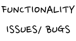
- Bugs: tags that looked clickable but weren't.
- No quick help - no chatbot or FAQ on the API pages.
What it needed to be
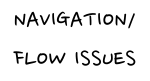
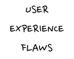
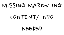
The old version's issues: look and feel, functionality bugs, flow, missing marketing content, and it didn't look secure. What the team and users wanted:
- Cool
- Smooth
- Secured
- Easy
- Informative
- To go global, and look lively, cool and attractive - in dark mode.
- A smooth experience with no navigation confusion, and the easiest way to try and use an API.
- To show scalability and efficiency.
- Designed around the funnel: acquisition (traffic → lead), activation (tried at least 1 API), engagement, revenue (buys credits) and retention.
Ver. 2: design decisions
My very first project at Arya.ai as a Sr. designer - as the only designer.
- Dark theme. Dark blue gradients with vibrant green and teal text, for the AI techy audience.
- Tested, not assumed. I asked 10 developers (20–30) and 6 PMs and sales people (30–40) about dark vs light: they found dark with cool gradients and smooth motion more engaging - and with huge text, not a readability problem.
- Raleway after secondary research and iterations - it suits huge headings with little text.
- Rounded, lively details: rounded cards and buttons, gradient card strokes, typing keywords, cards lifting on hover.
- Longer, but in order. Valuable content in a better order, with smooth transitions so it doesn't feel long - as 7/10 users said.
- Light where it matters. The API hub stays light - it's a text-heavy page where users make decisions.
A year later: ver. 3
Ver. 2 went quite well compared to ver. 1. A year later, marketing wanted a revamp - new structure, content and UI, keeping the dark, lively feel - and a move to Webflow for performance. Arya APPS was also being rebranded as Horizon AI (Apex, Nexus and Fusion).
- The problem: Arya.ai is used by leading financial institutions, but its unclear positioning made it look like a niche solution.
- The goal: clearer messaging, and Arya.ai as a leader in AI-powered automation.
- My part: with external designers on the visuals, I made all the design components.
The result
- 80%Conversion rate - sign up and contact, from better CTA placement
- 60%Average scroll depth - users explore, especially tech use cases
- ~8 secsTime to first interaction
The final website
My Role?
Sr. UI/UX Designer
Tools?
Figma
Timeline?
2 months
Company?
Arya.ai
Team?
1 designer + researcher (me) - ver. 2, external designers + 1 designer (me) - ver. 3,
1 frontend developer + 1 backend developer + my manager (growth head) + vp of engineering.
Arya.ai Website


Cool
Smooth
Secured
Easy
Informative


This version had -

“We want to go global”
“website should look lively and cool”
“not user centric”

“smooth feel and experience”
“should look secure”
“dark mode”
“attractive”
“smoother navigation across”
A few stages to keep in mind :-
Acquisition - traffic to lead.
Activation - lead to user (at least tried 1 API)
Engagement -
Revenue - buys credits
Retention - comes back for the service.
easiest try and use.
“Show scalability/efficiency”







The marketing team strongly wanted to revamp the website, a year after the version 2 🙂 →
For its structure and content and the UI - keeping the feel of the UI similar - dark, gradients and lively.
They wanted to shift the website to webflow, for the website performance and improvement reasons.
This went quite well as compared to the version 1.

But then there’s a twist!
Lively
Informative
Secured
Smooth






60%
Avg. scroll depth
Users are exploring multiple sections, especially tech use cases.
80%
Conversion Rate - Signup and Contact
Improved call-to-action placement has led to higher conversions.
~8 secs
Time to First Interaction
Reduced delay before interaction = higher UX efficiency.

More details?


More Projects?


